re-structure.ai
This page provides guidance and assets for the correct use of ReStructure AI trademarks and copyrighted materials. It is designed for all external entities engaging with our brand. Adherence to these guidelines is required when using ReStructure branding in third-party assets.
To keep visual impact, the logo needs ample, unobstructed space. All communications must keep a minimum clearance area, determined by the logo size and equal to its height.
The visual shorthand for our brand is the stacked bars symbol. Three offset bars abstract a structure being rebuilt: capture, restructure, deploy. It is built from three identical rectangles on a 72 unit grid.

The icon is positioned centrally and surrounded by generous space. The height of the holding device equals three times the height of the icon.
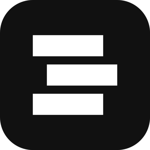
The symbol works best where space is limited, such as social profiles and app icons. It sits on black inside circles, rounded squares and squares.



Write the name as ReStructure AI. The logo is never redrawn, stretched, recolored or rebuilt from other characters.
The ReStructure ecosystem includes ReStructure AI, ReStructure Manpower and the Reese product line. Each uses the same symbol and its own palette.
The company brand. Monochrome: black, white and neutral grays. Type in Roboto.
The staffing and talent platform. Deep green is the primary color, with cool blue and warm paper tones.
Product line (Manpower, Portfolio, Loan Origination). Dark, near-black surfaces with neutral accents.
Roboto for interface and marketing. Roboto Mono for labels, numbers and code. Newsreader for contracts and all documents.